 Branding
 Web Design
 Social Media
 Studio Partner
In short: a logo is the brand’s signature, the mark that identifies it. A visual identity is the complete system (colour, typography, imagery, graphic elements and usage rules) that makes the brand recognisable even when the logo isn’t there. A logo works on a business card; a visual identity works on everything else.
When a business gets in touch asking for ‘a logo’, it’s almost never asking for just that. It wants to be recognised, to come across as trustworthy and to look just as good on a ten-metre banner as in an Instagram story. And a logo on its own doesn’t achieve that.
Try a quick test: open your brand’s latest social media post and cover the logo with your finger. Can you still tell whose it is? If the answer is no, the problem isn’t the logo. It’s everything that should surround it.
Logo and visual identity at a glance
| Logo | Visual identity | |
|---|---|---|
| What it is | The brand’s graphic signature. | The brand’s complete visual system. |
| What it includes | A mark and its versions (colour, single colour, small-size). | Logo, colour, typography, photography, graphic elements and usage rules. |
| Where you see it | Wherever the brand needs to be identified: header, signature, shopfront. | In everything the brand puts out, with or without the logo. |
| What it achieves | People can identify you. | People recognise and remember you. |
| What you receive | Logo files. | Files, templates and brand guidelines. |
What is a logo?
A logo is the mark that identifies a brand at a glance. It has to work at any size, from a website’s favicon to the sign on a shopfront, in colour and in a single colour, and on light and dark backgrounds. Although day to day everything gets called a ‘logo’, designers distinguish four forms, and each one suits a different kind of brand.
Wordmark
Text only: the brand name set in a carefully crafted typeface. It’s the most direct option when the name is short, easy to pronounce and worth remembering exactly as it is.
Symbol
Symbol only, no text. It works when the brand is already well known or needs a highly recognisable icon for small spaces: a social media avatar, an app or a favicon. For a new brand it’s rarely enough on its own.
Combination mark
Text and symbol that sit together but can be separated. It’s the most flexible form: you can use the full version on the website and just the symbol on your Instagram profile.
Emblem
Text and symbol merged into a single piece that can’t be separated, like a seal or a crest. It has a lot of personality, but it loses legibility at small sizes, so it’s wise to plan a simplified version.
Choosing one form or another isn’t a matter of taste. It depends on how well known the name already is, where the brand is going to live and the formats it has to appear in.
What is a visual identity?
A visual identity is the set of decisions that make everything a brand puts out recognisable as its own. It’s not a single piece, it’s a system, and each element has a job to do:
- Colour palette: not just which colours, but which one dominates and in what proportion they’re used. It’s the first thing people recognise from a distance.
- Typography: the brand’s written voice. One typeface family for headings, another (or the same one) for longer text and a clear hierarchy of sizes.
- Photography and art direction: light, framing and type of scene, so the photos look like they belong to the same family even when different people take them.
- Graphic elements: icons, shapes, textures or compositions that recur and give character.
- Usage rules: the brand guidelines, which turn everything above into rules anyone can apply.
It shouldn’t be confused with brand identity, which is broader: it includes the positioning, the values and the tone of voice the business uses. The visual identity is the part you can see.
A real case: Rhino & Face
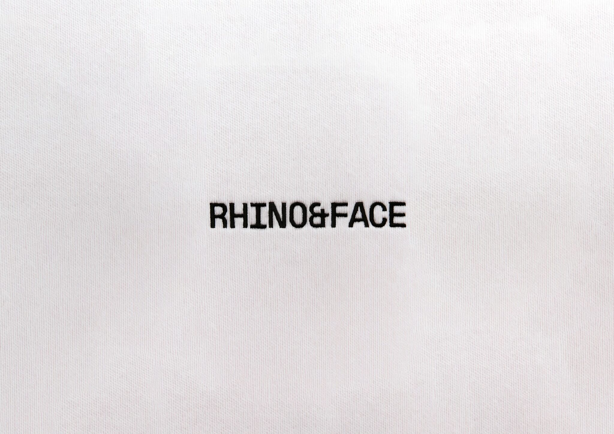
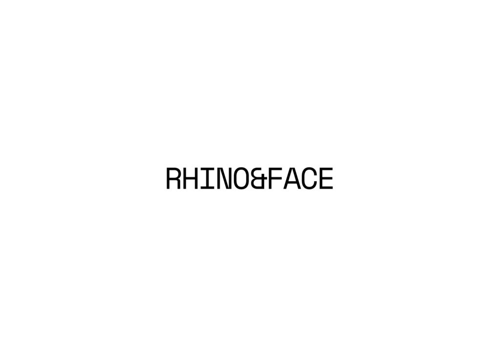
Rhino & Face is a cosmetic surgery and aesthetic medicine clinic in Palma with a very clear philosophy: harmony, not transformation. The challenge wasn’t to draw a pretty logo, but to make the whole brand convey medical trust without falling back on the usual tropes of the aesthetics sector.
That’s why we built the identity from scratch and designed the complete visual system before moving on to any application. With that system in place, the website, social media and editorial content were all developed with the same judgement. The result is a brand that’s recognisable on any channel, not just when the logo appears.
A brand isn’t just a logo. It’s the way a business presents itself, is recognised and stands out.
Àncar Studio
Five signs you need an identity, not just a logo
- Everyone on the team designs things their own way and nothing ever looks alike.
- The website, social media and printed materials look like they come from different businesses.
- Every new piece starts from scratch and takes longer than it should.
- The logo is fine, but the brand loses impact everywhere else.
- Nobody knows which colours or typefaces to use, or where the right files are.
So when is a logo enough?
You don’t always need a complete system from day one. If you’re testing an idea, launching a one-off project or your brand will have very few touchpoints, a good logo can be enough to get started.
Even so, it’s worth setting a minimum: the logo with its versions, two or three colours with their codes and a typeface. That stops every piece going its own way and gives you a base to build on when the time comes.
What you should receive from a visual identity project
If you’re commissioning an identity, this is the minimum list so you can use it without depending on anyone:
- Logo in all its versions: colour, single colour, reversed and small-size.
- Colour palette with codes for screen and print (HEX, RGB and CMYK).
- Defined typefaces, with licences if they’re paid fonts.
- Graphic elements and icons in editable formats.
- Examples of the identity applied to the formats you’ll actually use.
- Brand guidelines with the usage rules.
- Final files in vector (SVG, PDF) and image (PNG) formats, well organised and clearly named.
Frequently asked questions
How long does a visual identity project take?
It depends on the scope, but a complete branding project usually takes us between three and four weeks, from the first conversation to delivering the brand guidelines.
Can I change the logo without changing the whole identity?
Yes. When the brand works but the logo has started to look dated, the logo can be updated and the rest of the system adjusted around it. If the problem is the brand’s positioning or how it’s perceived, what’s needed is a rebrand.
What are brand guidelines and do I need them?
They’re the document that sets out how the identity is used: logo versions, colours, typefaces, margins, incorrect uses and examples. You need them as soon as more than one person (or more than one supplier) is going to create material for your brand.
Are visual identity and brand identity the same thing?
No. Brand identity covers who the business is: its positioning, its values and the way it speaks. The visual identity is the graphic translation of all that.
At Àncar we design complete visual identities from Palma de Mallorca, from the logo to the brand guidelines. If you’d like to see how we work, take a look at our branding and visual identity service or tell us about your project.