 Branding
 Web Design
 Social Media
 Studio Partner
In short: typefaces fall into six main families: serif (with finishing strokes), sans serif, slab serif, script, display and monospaced. Each one conveys something different. To choose one for a brand, first define its personality, think about where it will be used, and check that it reads well at small sizes, that it has enough weights and characters and that the licence lets you use it. And don’t combine more than two.
Typography is one of the design decisions people notice most and think about least. Before you read a single word, the shape of the letters has already said something: whether a brand is classic or contemporary, serious or friendly, expensive or affordable. That is why two businesses with the same name can look completely different just because of how it is written.
In this guide we look at the types of typeface that exist, how to recognise them and, above all, how to choose the right one for a brand, a website or your social media.
Before you start: five concepts worth knowing
- Serif: the small stroke that finishes off the ends of some letters. Whether it is there or not is the first thing that separates the families.
- x-height: the height of lowercase letters without ascenders or descenders, like the x itself. The larger it is, the more legible a typeface tends to be at small sizes.
- Weight: the thickness of the stroke: light, regular, bold and everything in between.
- Contrast: the difference between the thick and thin strokes of the same letter.
- Typeface and font: they are used as synonyms, but the typeface is the design (Helvetica, for example) and the font is each specific file or variant (Helvetica Bold, for example).
Types of typeface at a glance
| Family | How to recognise it | What it conveys | Well-known examples |
|---|---|---|---|
| Serif | Finishing strokes at the ends of the letters. | Tradition, prestige, seriousness. | Garamond, Baskerville, Bodoni, Times New Roman |
| Sans serif | No finishing strokes, clean lines. | Modernity, clarity, approachability. | Helvetica, Futura, Gill Sans |
| Slab serif | Thick, rectangular serifs. | Solidity, character, an industrial feel. | Rockwell, Clarendon |
| Script | They imitate handwriting. | Elegance or spontaneity, depending on the style. | Brush Script, Snell Roundhand |
| Display | Very distinctive shapes, designed to stand out. | Personality, impact. | Cooper Black, Bebas Neue |
| Monospaced | Every letter takes up the same width. | Technical, precise, a nod to the typewriter. | Courier, IBM Plex Mono |
Serif: with finishing strokes
They descend from letters carved in stone and from the printing press. They convey tradition, authority and care, which is why they still dominate in newspapers, publishing, professional firms and luxury brands. Within serifs there are three main styles:
- Old-style: low contrast and a warm feel, like Garamond, designed in the 16th century. Very comfortable for long texts.
- Transitional: a little more contrast and more regular shapes, like Baskerville, from 1757.
- Modern or Didone: extreme contrast between very thin and very thick strokes, like Bodoni or Didot. These are the ones on fashion magazine mastheads: spectacular at large sizes, delicate at small ones.
Sans serif: clean and unadorned
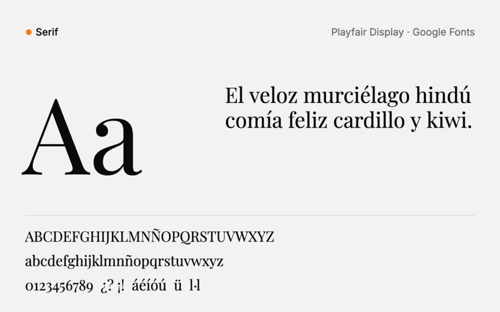
No finishing strokes, cleaner and more direct. Today they are the most widely used on screens, in apps and by brands that want to look current and approachable. They also have subfamilies with very different personalities:
- Grotesque and neo-grotesque: neutral and very versatile. Helvetica, from 1957, is the best-known example.
- Geometric: built from circles and straight lines, like Futura, from 1927. They convey order and modernity.
- Humanist: inspired by handwriting, with more organic strokes, like Gill Sans, from 1928. They tend to be the friendliest and most legible for long texts on screen.
Slab serif: serifs with character
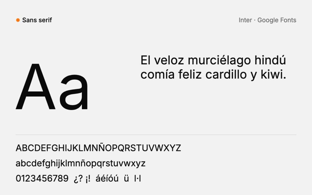
They have serifs, but in the form of a thick, rectangular block. They were born in the 19th century for posters and advertisements, and they keep that sturdy, slightly industrial feel. Rockwell is a good example. They work very well for headlines, product brands, food and crafts, and they read well from a distance.
Script or handwritten
They imitate writing with a pen, brush or marker. Formal scripts, with elegant joined-up strokes, are associated with invitations, fashion or weddings; informal ones, looser, convey spontaneity and warmth. They have a lot of personality but quickly lose legibility: they are for single words, logos or details, never for paragraphs.
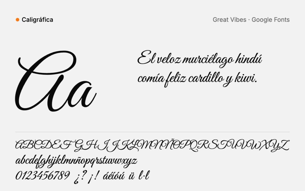
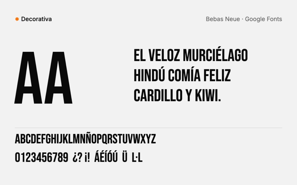
Display or decorative
They are designed to be seen large and to grab attention: headlines, posters, signs, covers. Cooper Black and Bebas Neue are two very popular examples. Used in moderation they add a lot of personality; used to excess they become tiring and look dated within a few years.
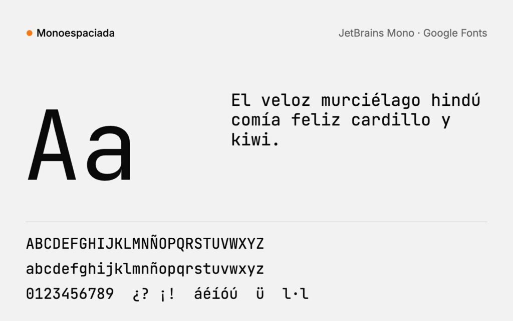
Monospaced
Every letter takes up exactly the same width, as on a typewriter. Courier, created in 1955, is the most recognisable. Today they are mainly used for code and for brands that want a technical, editorial or slightly retro feel.
How to choose a typeface for a brand
1. Define the personality before opening a catalogue
Write down three adjectives that describe your brand: friendly, solid and handcrafted, for example. Then rule out anything that doesn’t fit them. Choosing “a nice-looking font” first and then trying to make it make sense is the quickest way to end up with a typeface that doesn’t represent you.
2. Think about where it will live
A typeface for a logo that will be seen on a shop sign is not the same as one for website copy or the subtitles on a Reel. Make a list of the real uses: small screens, print, embroidery, packaging, signage. A typeface with very thin strokes can look beautiful on a poster and disappear on a mobile or in embroidery.
3. Check legibility
Type out a sentence at a small size and look at three things: whether the x-height is generous, whether open letters like “c” or “e” close up too much, and whether you can easily tell apart a capital “I”, a lowercase “l” and the number “1”. If you hesitate when reading it, your customers will too.
4. Look for a complete family
A good brand typeface has several weights, italics and every character you will need: the “ñ”, accents, the diaeresis, the Spanish opening marks “¿” and “¡” and, if you work in Mallorca or Catalonia, the Catalan geminated l (“l·l”). Many free or highly decorative typefaces don’t have them or handle them badly.
5. Check the licence
Typefaces are licensed, just like photos. Most Google Fonts are distributed under the SIL Open Font License, which allows commercial use. Adobe Fonts can be used for as long as you keep your Creative Cloud subscription. And paid typefaces are licensed by use: desktop, web, apps or advertising usually have different prices. Before building a brand on a typeface, make sure you can use it everywhere you are going to need it.
6. Test it with real content
No “lorem ipsum”. Type out your name, a headline from your website, a price, an address and a long paragraph. Print it, look at it on your mobile and leave it for a day. Typefaces that only work in the catalogue sample are quickly found out with real text.
Choosing a nice-looking font first and then trying to make it make sense is the quickest way to end up with a typeface that doesn’t represent you.
How to pair two typefaces
The most useful rule is simple: two typefaces at most, one for headings and one for body text. And to make them work well together:
- Look for contrast, not similarity. A serif for headings and a sans serif for body text, or the other way round, usually works. Two almost identical sans serifs look like a mistake.
- Make sure they share something. Similar proportions or x-heights help the whole thing look consistent.
- Play within the same family. If a typeface has lots of weights, sometimes it is enough on its own: bold for headings and regular for body text.
- Set a hierarchy. Fixed sizes, weights and spacing for heading, subheading, body text and notes. Consistency comes more from repeating that hierarchy than from the typeface itself.
Recommended free typefaces for each style
If you are just starting out or looking for a free alternative, Google Fonts has high-quality typefaces for every family. They are all open source and allow commercial use, although it is worth checking that each one includes all the characters you need.
| Family | Free typefaces | A good choice for |
|---|---|---|
| Serif | Playfair Display, EB Garamond, Lora, Libre Baskerville | Elegant headlines, fashion brands, editorial text. |
| Sans serif | Inter, Montserrat, DM Sans, Work Sans | Websites, apps, long texts on screen, contemporary brands. |
| Slab serif | Roboto Slab, Zilla Slab, Arvo | Headlines with character, food, products. |
| Script | Great Vibes, Dancing Script, Caveat | Details, signatures, invitations. Never long texts. |
| Display | Bebas Neue, Abril Fatface, Anton | Posters, covers, very large headlines. |
| Monospaced | JetBrains Mono, IBM Plex Mono, Space Mono | Code, tech brands, editorial details. |
As well as Google Fonts, Fontshare offers high-quality typefaces that are also free for commercial use. On other download sites, always check the licence: many “free” fonts are only free for personal use and can’t be used for a brand.
How to identify a typeface
You see a poster, a website or a logo and want to know which typeface it uses. There are several ways to find out:
- From an image: tools such as WhatTheFont, from MyFonts, or Font Squirrel Matcherator analyse a photo or a screenshot and suggest the closest typefaces.
- From your mobile: the Adobe Capture app recognises typefaces from a photo and suggests similar options from Adobe Fonts.
- From a website: right-click on the text, choose “Inspect” and look for the font-family property. There are also browser extensions, such as WhatFont, that show it when you hover over the text.
For the best results, use a sharp, straight image with several different letters and no effects. And bear in mind that many logos use hand-drawn or hand-modified lettering, so sometimes you will find a similar typeface rather than the exact one.
Typography on the web: what you need to know
- Size: for long texts on screen, around 16 pixels is a good minimum; on mobile, it is best not to go below that.
- Line spacing: between 1.4 and 1.6 times the font size makes paragraphs much more comfortable to read.
- Line length: between 45 and 75 characters per line is the easiest to read. Very wide columns are tiring.
- Contrast: light grey on white looks elegant in the design and is unreadable for many people. Better to have enough contrast.
- Speed: every font weight is a file the website has to download. Load only the ones you use, in WOFF2 format, and consider variable fonts, which bring all the weights together in a single file.
The most common mistakes
- Using too many typefaces. Three or four different typefaces in the same piece make it look messy.
- Script typefaces in long texts. What is charming in a logo is unreadable in a paragraph.
- Choosing what is trendy. Fashionable typefaces are instantly recognisable and age just as quickly.
- Forgetting the licence. Finding out you can’t use your typeface on the website or in an ad once the brand is finished is an expensive surprise.
- Not checking the characters. A missing “ñ” or accent forces you to mix fonts, and it shows.
- Changing typeface with every piece. The brand loses consistency. That is why it is set out in the brand guidelines.
Frequently asked questions
What is the most legible typeface?
There is no single answer. On screen, sans serifs with a generous x-height and open shapes, such as humanist ones, tend to read best. For long printed texts, many classic serifs are still very comfortable. More than the family, what matters is size, line spacing, contrast and line length.
Can I use a free typeface in my logo?
It depends on its licence. Those licensed under the SIL Open Font License, like most Google Fonts, can be used in logos and for commercial purposes. But bear in mind that anyone can use the same typeface, so your logo will be less exclusive. Many brands start from an existing typeface and modify it to make it their own.
How many typefaces should a brand have?
One or two. A single family with several weights is usually enough; two if you want a clear distinction between headings and body text. Beyond that, every new typeface chips away at consistency.
What is the difference between a typeface and a font?
In everyday use they are treated as synonyms. Strictly speaking, the typeface is the design of the letters and the font is each specific file or variant: Garamond is the typeface and Garamond Italic is one of its fonts.
Where can I download free fonts with a commercial licence?
Google Fonts and Fontshare are two good options: all their typefaces can be used in commercial projects. On other download sites, read the licence before using a font for your brand; those marked “free for personal use” do not allow commercial use.
Typography is just one part of a brand’s identity, as we explain in the difference between a logo and a visual identity. If you are defining yours, our branding service explains how we work.


