 Branding
 Web Design
 Social Media
 Studio Partner

In short: restaurant branding isn’t just the logo. It is everything customers see before, during and after their meal: the shopfront, the menu, the takeaway boxes, the staff clothing and social media. A place is remembered when all of that tells the same story, with a personality of its own that is well executed, and stays just as well looked after on day one as two years later.
In a restaurant, the brand starts long before anyone sits down at a table. It starts with the sign people see as they walk down the street, with the Instagram profile someone checks before booking and with the box that arrives at home on a Friday night. And it carries on afterwards: in the photo the customer posts and in the urge to come back.
That is why, when a restaurant asks us for “a logo”, it almost always needs something more: an identity that works on the street, at the table, on deliveries and on a mobile screen.
What restaurant branding is
It is the set of decisions that give a place a recognisable personality: what it is called, how it speaks, which colours and typefaces it uses, what tone its menu has and how it looks everywhere it appears. The logo is just one piece of that system, as we explain in the difference between a logo and a visual identity.
In hospitality, that identity is put to the test on far more formats than in other sectors, and almost all of them are physical: they get handled, they get stained, they are seen from a distance or very close up.
Where a restaurant brand is won or lost
| Touchpoint | What it needs to achieve | The detail that makes the difference |
|---|---|---|
| Shopfront and sign | Getting you seen and recognised from the street. | A colour or an element that can be identified from a distance. |
| Menu | Easy to read and conveying the tone of the place. | Speaking the same way as the team and the kitchen. |
| Packaging and takeaway | Getting your brand into the customer’s home. | Boxes and bags people want to photograph. |
| Staff clothing | Making the team part of the brand. | Clothes the team actually want to wear. |
| Front-of-house items | Consistency in every detail on the table. | Coasters, napkins or receipts with the same care. |
| Social media | Letting people get to know the place before they walk in. | Your own photos and videos in the same style as the place. |
A real case: Malandra Pizza & Co
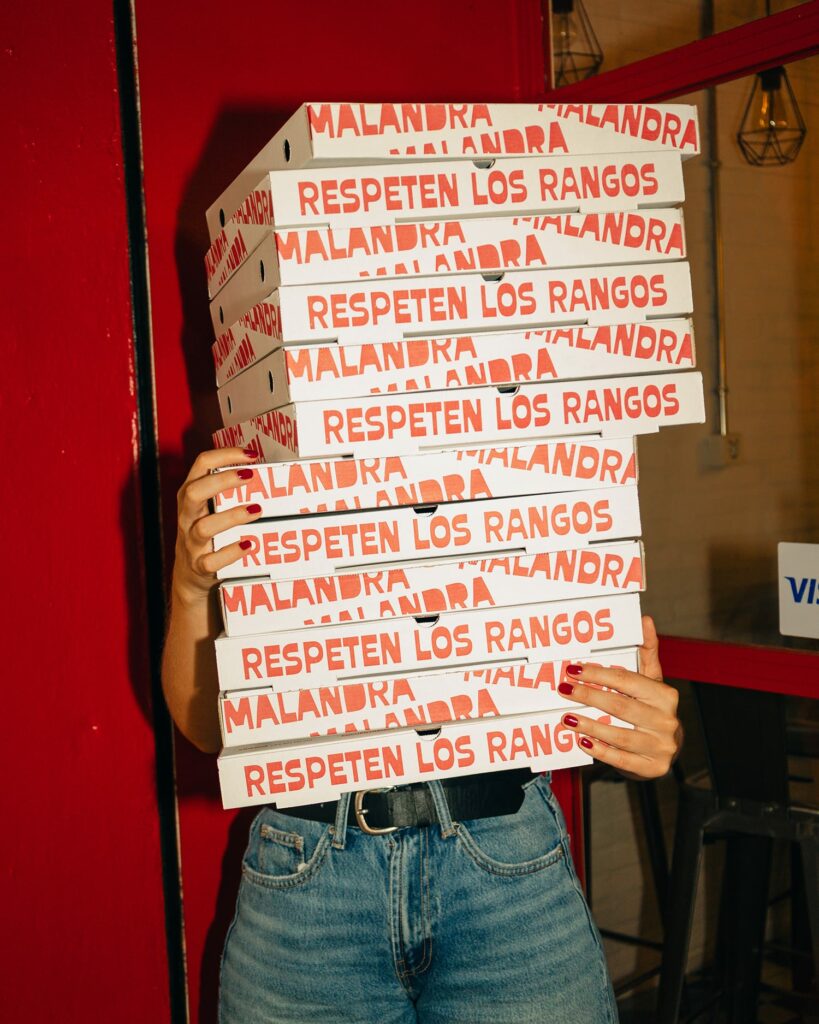
Malandra is an Argentinian pizzeria in the centre of Palma, serving pizzas and empanadas to eat in or take away. The name and the slogan, “Respeten los rangos”, came from the owners themselves. Our job was to give them shape: a brand with a roguish streak, laid-back and with a neighbourhood feel.
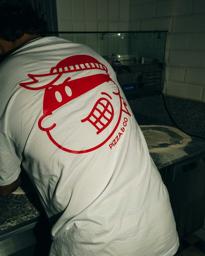
That gave rise to the character, a lovable rogue with a neckerchief and a cheeky grin who signs the logo and appears on every piece, set against a bold red you can see from the other side of the street. We designed the logo, the character, the shopfront sign, the pizza boxes with the slogan, the menus and the staff T-shirts. All in the same tone: direct, funny and never solemn.
The identity didn’t stay inside the restaurant. Since it opened in August 2025 we have also been running its social media with the same character, and within a year the account passed 4,000 followers. In August 2026 it opened its second site, with a brand that was already recognised in the neighbourhood.
A restaurant is remembered when everything you see of it tells the same story.
Àncar Studio
Other ways to build an identity
Not every restaurant needs a character. Personality can come from many places, and sometimes the brand already exists and what is missing is applying it well to every piece.
Illustration as a language of its own
For Blend Brunch, a speciality coffee shop in Puerto de Andratx, we created the illustrations that shape its visual world. They are pieces with a character of their own that reinforce the identity at every touchpoint and make its communication unlike that of any other coffee shop.
Applying an existing brand with good judgement
At Izizi Nunnak, a seafront restaurant and cocktail bar in Portixol, the logo already existed. Our job was to design the menus, the coasters and the rest of the materials so that they all spoke the same visual language. Very often the difference between a brand that works and one that doesn’t lies right there: in how it is applied.
The mistakes we see most
Copying the trendy look
Every season there is a style that half the sector repeats: the same typefaces, the same colours, the same neon signs. It works for a few months and then makes the place look like just another one. A good brand starts from what makes your restaurant unique, not from what is in fashion.
A logo rushed out with automatic tools
Generating a logo with artificial intelligence or a template can seem like a quick fix, but the result is usually generic, hard to reproduce on a sign or a box and, sometimes, suspiciously similar to others. A brand needs judgement: thinking about where it will live and what it needs to convey.
Cutting corners on materials
A laminated menu that peels, boxes that lose their shape or a sign that fades in a single summer say a lot about a place, even if the food is excellent. Materials are part of the brand too, and in hospitality they get heavy use.
Not sticking to the identity once it is created
This is the most common mistake. The brand is carefully designed and, a few months later, hastily made posters appear, a different typeface turns up on the new menu or colours appear that nobody remembers choosing. An identity only works if it is respected in every new piece, and that is what brand guidelines are for.
The menu, the most-read piece
Of everything a restaurant designs, the menu is what customers look at most closely and for longest. That is why it deserves special care:
- Clear hierarchy: sections, dishes and prices should be easy to tell apart at a glance.
- Type that is legible in low light. What reads well on the designer’s screen may not be readable on a terrace at night.
- Short descriptions in the tone of the place. Better to say what goes into a dish and where it comes from than to use adjectives that could be on any menu.
- Clearly marked allergens. This information is mandatory and has to be easy to find.
- Materials that stand up to daily use, stains and the sun.
- Easy to update. A well-prepared template lets you change prices or dishes without redoing the design.
- The digital version, just as carefully done. If the menu is viewed through a QR code, it should look good on a mobile and keep the same identity.
When to start on the brand
Earlier than you might think. A branding project usually takes us between three and four weeks, but then come the production times: printing, signage, boxes, clothing. Ideally the brand should be finalised before you order anything printed and before work starts on the shopfront, so nothing has to be redone.
What you should have at the end
- A logo in all its versions, including a single-colour one for stamps, boxes or embroidery.
- A colour palette with its codes for print and screen.
- Typefaces set for the sign, the menu and social media.
- The brand’s own elements: character, illustrations, patterns or icons.
- Templates for the menu and the pieces that change often.
- The main applications designed: sign, packaging, clothing and front-of-house items.
- Brand guidelines so that any future piece follows the same line.
How to tell if your restaurant’s brand is working
- Customers recognise it outside the restaurant: on a box, in a photo, on a T-shirt.
- It shows up in the photos your customers post. The shopfront, the tableware or the packaging appear in their posts.
- Everything tells the same story: the menu, the sign, social media and the way the team treats people all fit together.
- The team applies it without hesitation when they need to put together a poster, an offer or a post.
- It attracts the customers you are looking for. A brand filters: it draws in the people who fit what you offer.
Frequently asked questions
How long does a restaurant branding project take?
Designing the identity usually takes between three and four weeks. On top of that come each supplier’s production times, which depend on the material and the quantity.
Does it make sense for a small place or a takeaway business?
Yes, and often even more so. When the place is small or much of the business is takeaway, the box, the bag and the Instagram profile are almost all the customer sees of you.
Can you refresh the brand without closing the restaurant?
Yes. A rebrand can be rolled out in phases: first what is most visible, such as the sign, the menu and social media, and then the rest as materials are replaced.
Is it a good idea to have the same team handle the brand and social media?
It helps a lot. If whoever designs the brand also produces the photos and videos, your social media has the same style from day one. That is what we do in our social media management service.
At Àncar we design identities for restaurants, coffee shops and hospitality businesses in Mallorca, from the shopfront to social media. If you are about to open or want to refresh the look of your place, take a look at our branding in Mallorca service or tell us about your project.


